CASE STUDY
Turning Weeks of Churning into a Successful Launch
Low trust and lack of clear guidance caused the Loan Snipe team’s productivity to grind to a halt.
ROLE
Product Design Manager
Content Strategist
FOCUS
Experiment Design
Cross-Function Collaboration
OVERVIEW
Loan Snipes was a funnel optimization initiative focused on improving how members understood and evaluated personalized loan recommendations. What initially appeared to be a visual design problem was ultimately a trust and comprehension challenge: members perceived recommendations as advertisements rather than actionable financial guidance. The work ultimately established a repeatable experimentation framework that scaled across lending products and informed future AI-assisted debt guidance initiatives.
The problem wasn’t the design, it was how the team was organized.
The team’s organizational structure made alignment difficult: multiple PMs were working across designers with overlapping ownership, creating churn, inconsistent direction, and reactive experimentation instead of a cohesive learning strategy.
THE TEAM ORG
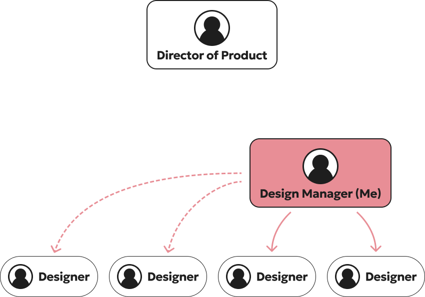
Team structure created fragmented ownership across designers and PMs, making alignment and decision-making difficult.
Design Challenge #1
Users needed a clearer and more trustworthy way to evaluate personalized loan recommendations within the context of their existing financial situation.
❌ Lack of Trust
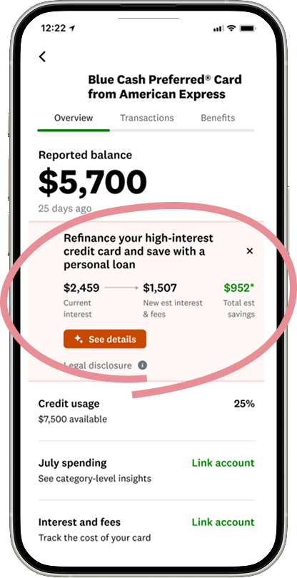
The first experiment focused on a recommendation module surfaced directly within a member’s existing credit card experience. The team initially believed the low-performing funnel was a visual design problem and concentrated on incremental UI changes—color updates, promotional treatments, and off–design system components—to drive engagement.
However, user testing revealed a deeper issue: members did not trust the recommendation because the estimated savings lacked enough context to support a confident financial decision. Members were skeptical that the recommendation accounted for hidden costs, fees, or tradeoffs associated with switching products.
Compounding the issue, tapping into the experience routed users to a generic marketing detail page that broke continuity with the personalized recommendation and further reduced trust. I reframed the problem from a visual optimization exercise into a comprehension and confidence-building challenge, shifting the team toward designing clearer contextual guidance, stronger information hierarchy, and more transparent comparisons that better supported decision-making throughout the funnel.
Design Challenge #2
Users could not easily discover or engage with the personalized recommendation because the experience used unclear signifiers and disconnected entry points that broke continuity throughout the funnel.
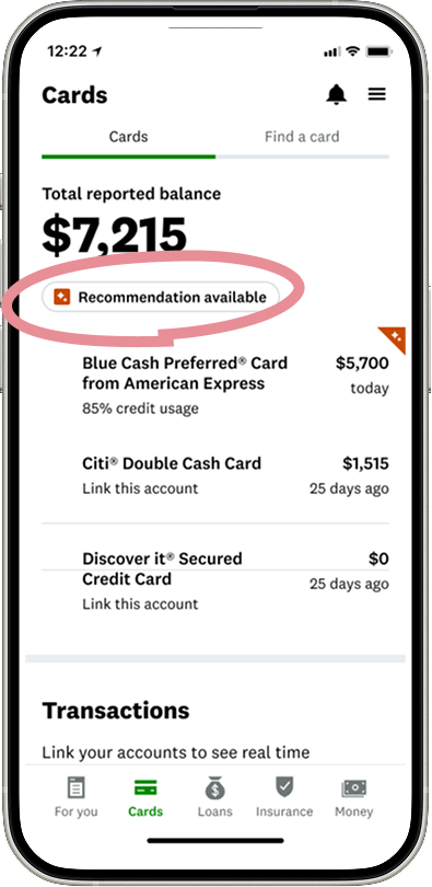
❌ False Signifier
The second experiment built on these findings by addressing a critical usability issue earlier in the funnel. User testing revealed that members interpreted the “Recommendation available” pill as interactive and repeatedly attempted to tap it, creating confusion and frustration when nothing happened.
The recommendation itself was buried within the card detail experience, forcing users to hunt for context and weakening the connection between the personalized insight and the action we wanted them to take. This exposed a broader issue with information scent and signifiers throughout the experience: members could not clearly understand where the recommendation lived, what it referred to, or how to engage with it.
Instead of continuing to optimize visual treatments, we focused on improving discoverability, interaction clarity, and continuity between the recommendation entry point and the downstream decision-making experience.
DESIGN CHALLENGE #3
Unrepeatable & Unscalable Design, No Formal Experimentation Process
The team had identified a high-performing recommendation pattern, but it relied on components outside the design system and couldn’t scale across products. At the same time, there was no formal experimentation process to validate why certain designs performed better, making decision-making reactive and inconsistent. I pushed the team to establish a more structured testing framework grounded in user behavior and measurable outcomes.
My Hypothesis
From user testing, we learned that members were not evaluating recommendations based on estimated savings alone. Before they felt comfortable moving forward, they wanted to understand the full financial tradeoffs , including monthly payment, APR, fees, and loan term, in the context of what they already had. I worked with the team to define a clearer hypothesis: if we surfaced the right financial information upfront in a transparent side-by-side comparison, members would feel more confident evaluating the recommendation and be more likely to convert.
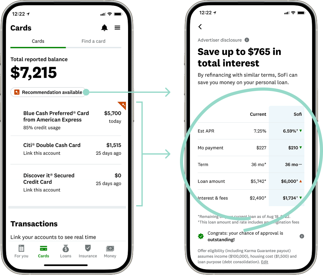
Side-by-Side Comparison
I believed that increased impression to conversions will be achieved if members can more easily evaluate the recommendation with this feature.
Affirm User Behavior
I also proposed that we affirm the user’s behavior of tapping on the “Recommendation Available” element by simply making it an active button.
The Design We Shipped
I aligned the team around a shared hypothesis grounded in user research: users needed transparent financial comparisons, not promotional messaging, to confidently evaluate recommendations. After validating the concepts through iterative testing, we launched the experience as an experiment focused on improving trust, comprehension, and conversion across the recommendation funnel.
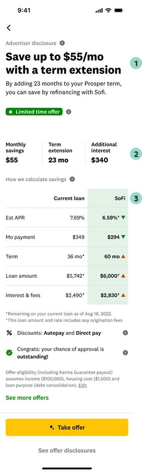
1. Recommendation Header
We reframed the header around monthly savings and term extension to immediately communicate the core refinancing tradeoff and make the recommendation feel more actionable.
2. Financial Tradeoffs
We surfaced monthly savings, term extension, and additional interest together to provide transparent context around the financial impact of refinancing.
3. Comparison Table
We introduced a side-by-side comparison table of APR, monthly payment, term, and fees to help members quickly evaluate the recommendation against their current loan.
The Outcome
After launch, the new recommendation framework drove a +3.75% increase in CTR to Snipes (reaching 15% of MAUs) and contributed over $2M in quarterly revenue across loans, credit cards, and home loans.
68%
Of customers benefited in some meaningful way
$68m⤴
Increase in some meaningful metric
68⤵
Decrease in some meaningful metric
DESIGN
Masa Edie
Design Manager
First Last
Role Title
First Last
Role Title
RESEARCH
First Last
Role Title
First Last
Role Title
First Last
Role Title
ENGINEERING
First Last
Role TItle
First Last
Role Title
First Last
Role Title