CASE STUDY
Turning Weeks of Churning into a Successful Launch
Low trust and lack of clear guidance caused the Loan Snipe team’s productivity to grind to a halt.
ROLE
Product Design Manager
Content Strategist
FOCUS
Experiment Design
Cross-Function Collaboration

OVERVIEW
Loan Snipes was a funnel optimization initiative focused on improving how members understood and evaluated personalized loan recommendations.
What initially appeared to be a visual design problem was ultimately a trust and comprehension challenge: members perceived recommendations as advertisements rather than actionable financial guidance.
Across a series of experiments, my team explored how clearer framing, contextual information, and side-by-side comparisons could help members make more informed decisions and move through the funnel with greater confidence.
The work ultimately established a repeatable experimentation framework that scaled across lending products and informed future AI-assisted debt guidance initiatives.
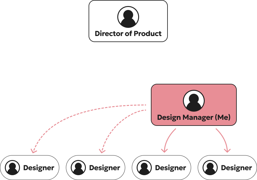
The biggest problems were caused by how the team was organized.
Designers lacked clear guidance, leading to churn across experiments and inconsistent execution. The project’s learning agenda was not clearly defined, which created communication breakdowns and low trust between cross-functional partners.
The organizational structure further complicated alignment: two PMs were paired with the designers I directly managed, while another two PMs were working with designers outside my reporting line that I still needed to influence and coordinate with. Without clear ownership, shared success metrics, or a consistent experimentation framework, the team defaulted to reactive execution instead of strategically evaluating what members actually needed to make informed financial decisions.
THE TEAM ORG
This is a caption.
DESIGN CHALLENGE #1
Building trust through personalization
The team initially believed this low-performing funnel was a visual design problem and concentrated on incremental UI changes—color updates, promotional treatments, and off–design system components—to drive engagement.
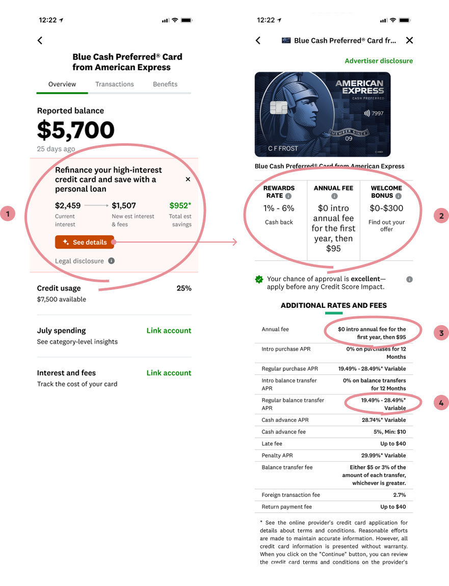
However, user testing revealed a deeper issue: users did not trust the recommendation because the estimated savings lacked enough context to support a confident financial decision. Members were skeptical that the recommendation accounted for hidden costs, fees, or tradeoffs associated with switching products.
Compounding the issue, tapping “See Details” routed users to a generic marketing detail page that broke continuity with the personalized recommendation and further reduced trust.
I reframed the problem from a visual optimization exercise into a comprehension and confidence-building challenge, shifting the team toward designing clearer contextual guidance, stronger information hierarchy, and more transparent comparisons that better supported decision-making throughout the funnel.
1. Users don’t trust the recommendation
Estimated Savings doesn’t capture all the costs and benefits associated with the recommendation.
People are skeptical that we’ve considered all the hidden costs of switching products.
2. Users don’t need more marketing
At this point in the flow, users need personalized information to help them make an informed decision.
3. Fees aren’t transparent
Users would benefit from seeing the fine print clearly laid out, so they know exactly how much they will pay in fees for the first year and beyond.
4. Variable rates aren’t helpful
Users need to know exactly what rate they can expect to pay given their credit rate, not given a vague “variable” range.
DESIGN CHALLENGE #2
False Signifier
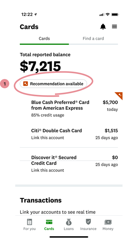
User testing revealed that members interpreted the “Recommendation available” pill as interactive and repeatedly attempted to tap it, creating confusion and frustration when nothing happened.
The recommendation itself was buried within the card detail experience, forcing users to hunt for context and weakening the connection between the personalized insight and the action we wanted them to take. This exposed a broader issue with information scent and signifiers throughout the experience: members could not clearly understand where the recommendation lived, what it referred to, or how to engage with it.
Instead of continuing to optimize visual treatments, we focused on improving discoverability, interaction clarity, and continuity between the recommendation entry point and the downstream decision-making experience.
1. It looks interactive, but it’s not
Users try to tap the recommendation pill and are frustrated when nothing happens. They are then unsure how to see what the recommendation is.
DESIGN CHALLENGE #3
Unrepeatable & Unscalable Design, No Formal Experimentation Process
There’s no way to tell why
DESIGN
Masa Edie
Design Manager
First Last
Role Title
First Last
Role Title
RESEARCH
First Last
Role Title
First Last
Role Title
First Last
Role Title
ENGINEERING
First Last
Role TItle
First Last
Role Title
First Last
Role Title